
They made charts. Someone looked at an Iran war reaching day 100 and thought "the people need visualizations."
Oil went up. Then down. Then up again. A line wiggled across a graph like a drunk driver's polygraph. Markets "reacted." Currencies "fluctuated." Traders "positioned themselves" for scenarios that never happened.
The charts showed nothing you couldn't learn from opening your eyes. Conflict makes things expensive. Sometimes it doesn't. Peace talks might happen. They might not. The S&P moved in ways that had precisely fuck-all to do with Iran and everything to do with the fact that markets move because they have to move somewhere.
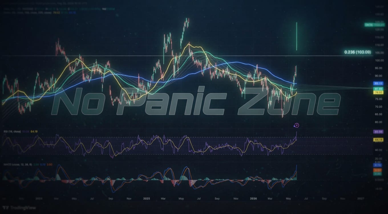
But sure. Put it in a bar chart. Add some color coding. Red for bad things. Green for good things. Slap a trendline on there like you're discovering gravity for the first time.
Retail traders printed these charts. They studied the correlations between missile strikes and wheat futures. They drew support lines at geopolitically significant price levels. They believed—actually believed—that the pattern of global economic disruption could be captured in a candlestick formation.
The article promises to show "how global markets and the economy have been affected." Translation: things that were going to happen anyway now have an Iran-shaped narrative wrapper. Inflation existed before day one. It'll exist after day 100. The dollar was volatile in January. Shocking development: still volatile.
Peace negotiations hang in the balance. Markets hang in the balance. Your portfolio hangs in the balance. Everything hangs in the balance when you're a financial journalist who needs 800 words by deadline.
The charts told you what you already knew: war is uncertain, markets hate uncertainty, and uncertainty creates volatility until it doesn't.
Day 101 will require new charts showing the exact same nothing.
Photo by Saifee Art on Unsplash


Leave a Comment