

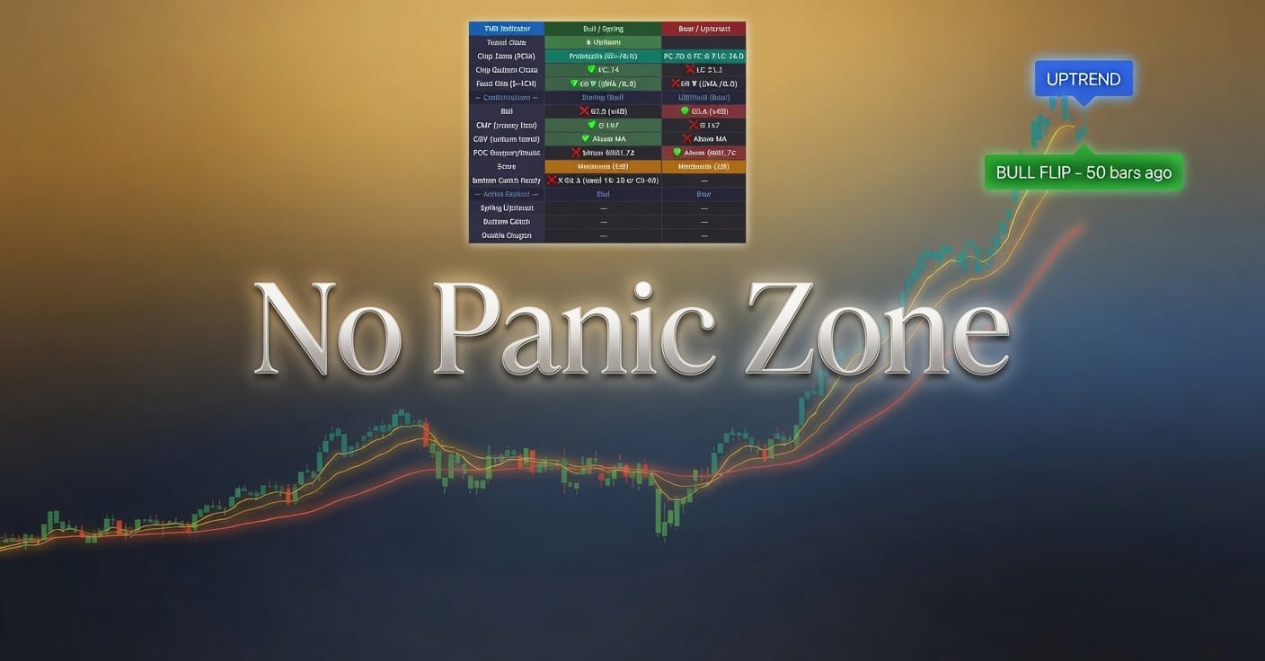
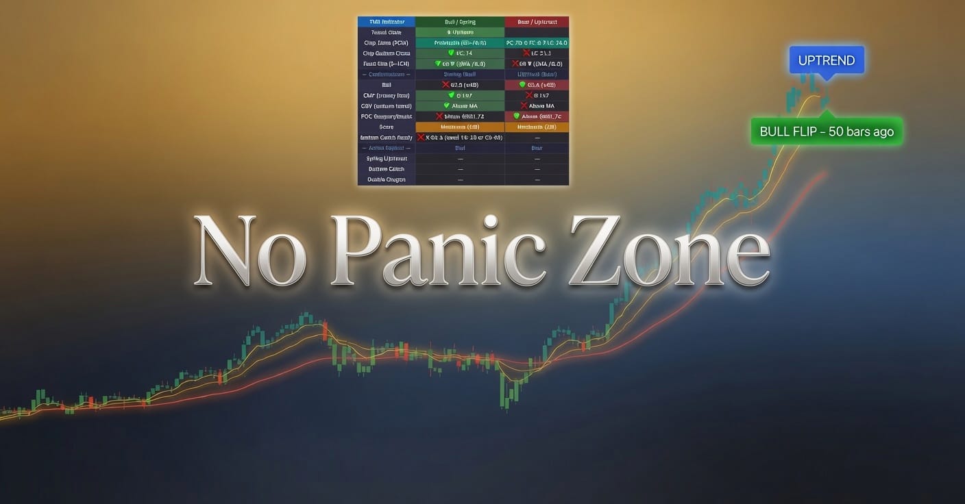
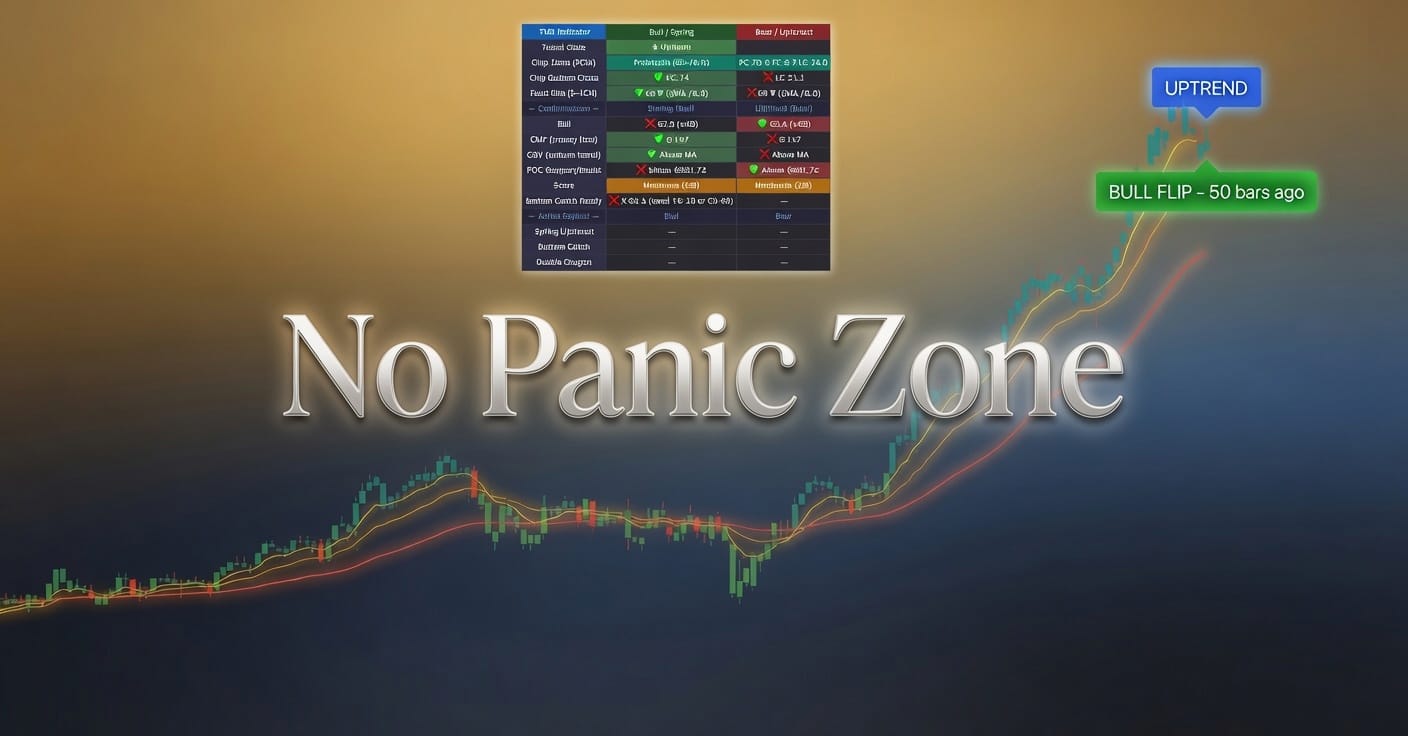
Frank Cappelleri looked at multiple charts. He found three reasons. Bitcoin might go up. Or it might not. The charts told him this with absolute certainty, the way tea leaves tell your aunt she'll meet a tall stranger who also happens to be her mailman.
The cryptocurrency bounced recently. Bounced is the technical term analysts use when a number goes up after it went down. Before that it went up. Then down. Then up again. The charts reveal this pattern with stunning clarity if you squint hard enough and already decided what you wanted to see before you opened TradingView.
Three reasons exist. Cappelleri walked us through them. Reason one involves a line. Reason two involves a different line. Reason three is presumably a third line, though at this point does it really matter which line we're pretending means something.
Retail traders will see this analysis and immediately market-buy Bitcoin at 2 a.m. on a Saturday using 50x leverage on an exchange that rhymes with Shady Overseas Scam Depot. They will cite Cappelleri's lines as their thesis. When Bitcoin drops 30% on Monday because Elon Musk tweeted a picture of a ham sandwich, they will blame market manipulation. They will not blame the lines. The lines were good. The lines made sense. The market was simply too corrupt to respect Frank's lines.
The bullish move could be starting. Could is doing a lot of work in that sentence. Could is the difference between financial analysis and a fortune cookie. Could means maybe. Maybe means I don't know. I don't know means why are we drawing lines on charts and calling it journalism.
Cappelleri provided multiple charts because one chart would have looked like guessing, but multiple charts looks like research.
Photo by André François McKenzie on Unsplash





Leave a Comment